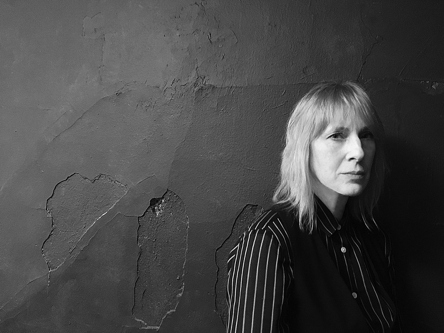
We checked in with PD Packard.
How did your creative journey bring you to this place?
I’ve always had a natural love of color. When growing up in Washington, D.C., and trying to determine how I would make an income with this love of color, I believed that going to a university would be the answer. I began studying fashion design at Parsons School of Design in NYC. Through an exchange program, I applied for and was awarded a full scholarship to Saint Martin’s School of Art (aka Central Saint Martin’s), in London, England. There I obtained a BFA in Fashion and Textile Design. At Saint Martin’s I was given a lot of creative freedom, something that had been missing at Parsons. Most of my days at Saint Martin’s were spent working in the textile department dyeing and printing fabrics, and then executing many self-indulgent, crazy-butt ideas for clothing and accessories that weren’t viewed as very commercial by my teachers. It was a wonderful foundation and even today experimenting without restraints is a very important part of developing any of my ideas, helping me discern and refine each step towards completion.
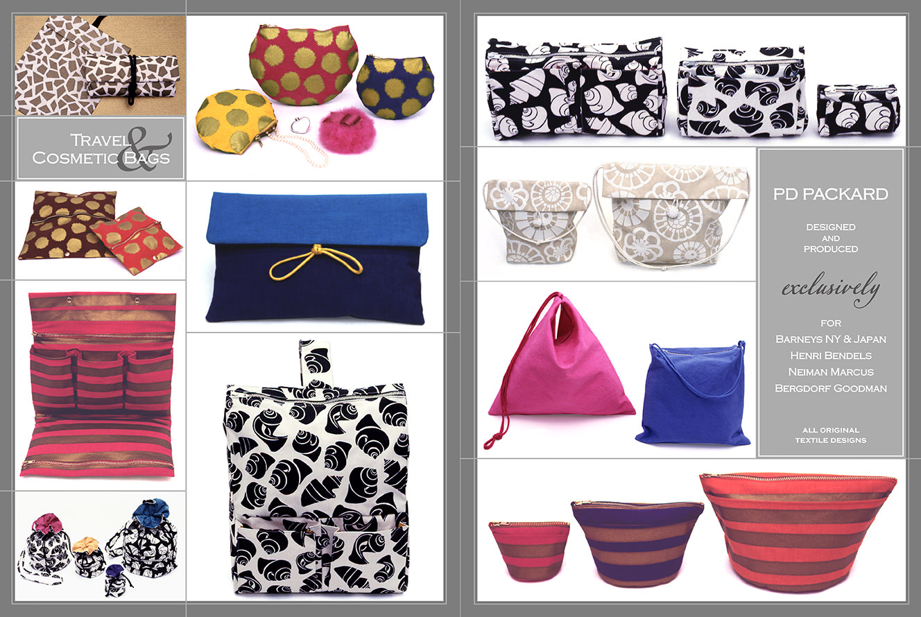
When I returned to the states in the late 80s, I began designing packaging, POP displays, and original textile and surface designs primarily for the cosmetic industry in NYC. Under my own label, PD Packard, I also designed and produced exclusive lines of travel and cosmetic bags for the department stores Barneys New York & Japan, Neiman Marcus, Henri Bendel, and Bergdorf Goodman that were sold nationally and internationally. There’s real money to be made in production. The problem was that I felt I was always squeezed like a lemon, asked to produce cheaper, faster, and to make it happen yesterday. I grew to dislike the work and one day decided to stop. Many of the principles in printmaking are similar to fabric and surface design making an easy and natural transition for me into fine art printmaking in 2009.
How would you define your art and what is the meaning behind your work?
I am called a Multimedia Artist, using printmaking in combination with different medias and techniques; photography, animation, and painting to share my love for color, and pattern. My work is committed to bringing attention to the power that Nature has to influence our perception of art and design.
I am not the expressor, I am the expression. When I begin a project, I try to let go of my ego and be open and receptive to inspiration. In the essay, “The Untroubled Mind” (1972), the painter/author Agnes Martin, speaks of art as beauty, and states that this beauty is unattached, that it’s in your Mind; it’s inspirational. I believe that this inspiration is free and available to all, beyond person, place, or thing; it’s unconditional Love. Unconditional Love means that I will remain committed to my work even if the condition seems unfavorable. Regardless of the circumstance or outcome, I am self-motivated to continue my work because of this unconditional Love.
Can you describe the importance of paper (or other mediums) in your work, what type of paper (medium) you use most, and why?
Medium: Relief printmaking method, M-0207 Kozo White Text Weight with Sizing-56gsm and M-0202 Natural Kozo Medium Weight-44gsm.
Size: 25” height x 37” width
Dates: Various
The paper I use is basically Kozo x Kozo = Kozo.
Initially, when creating my artwork, I used mostly papers made from cotton. Around 2010, I met the NYC-based Japanese artist, Yasuyo Tanaka, while taking a class on Japanese Bookbinding with her at the Manhattan Graphics Center. I noted how wonderful the collection of Japanese Kozo papers that Yasuyo used, and she shared Paper Connection as her source. Since then, I’ve been using Paper Connection’s fine art papers, specifically whites, and naturals, in my work.
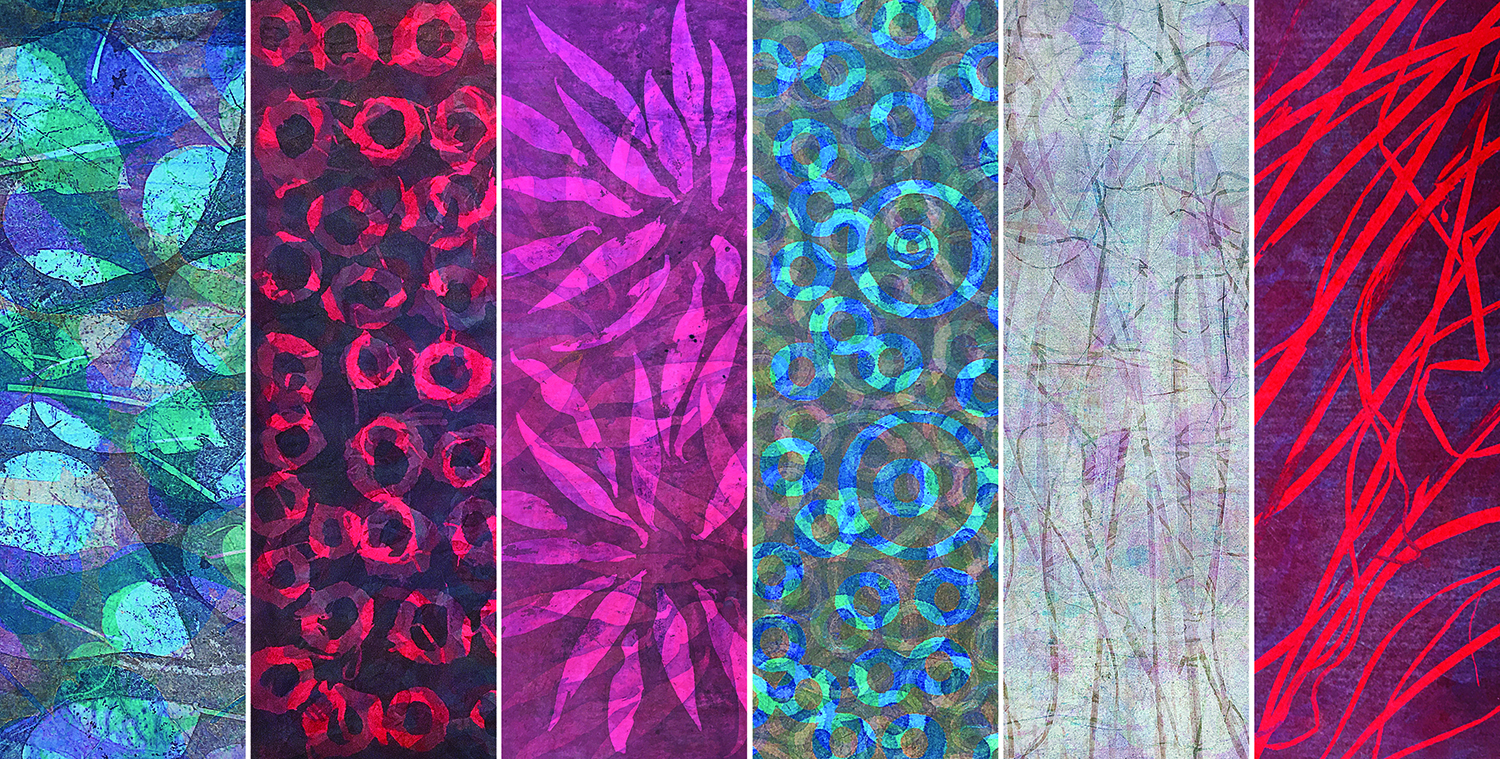
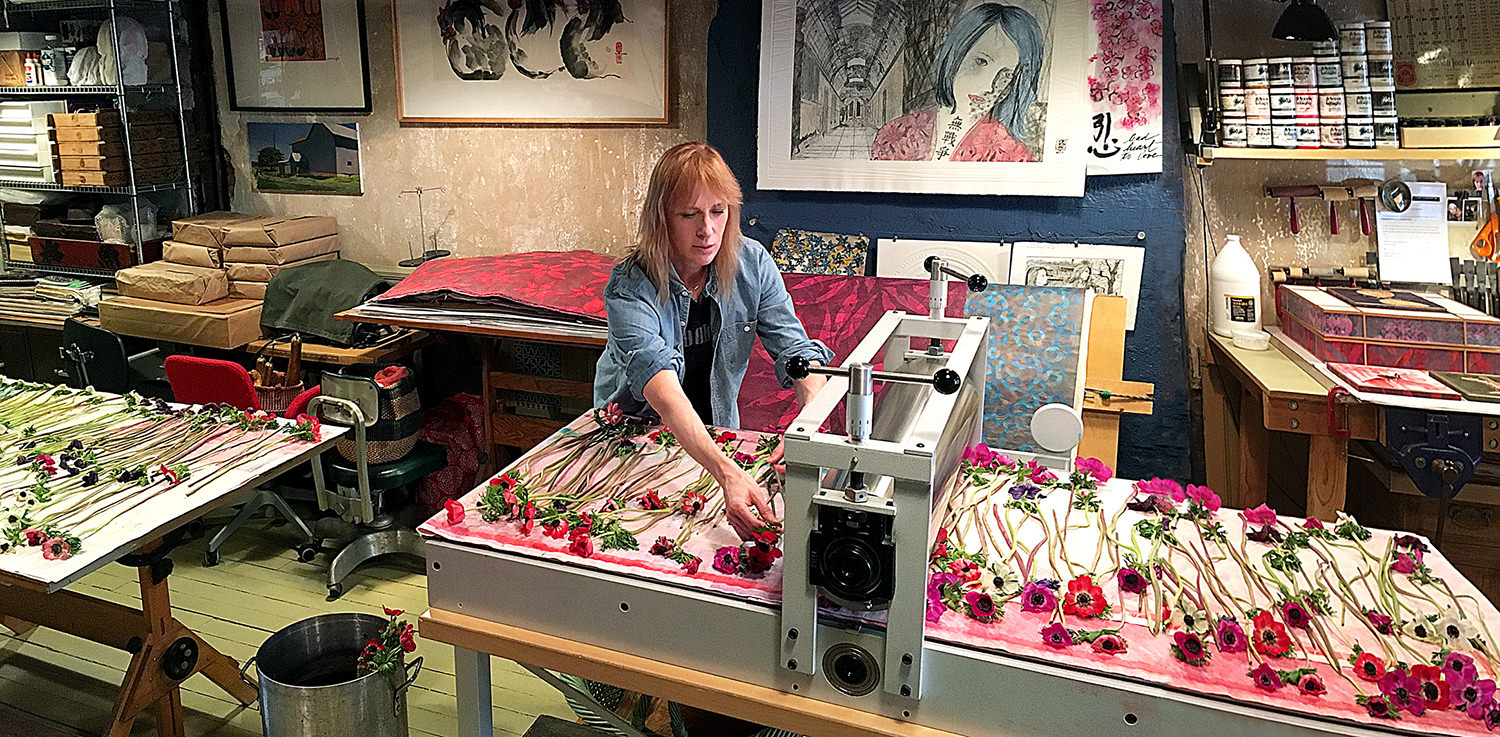
My foundation is painting. I love the depth of color I can achieve through layering when working in watercolors. In 2009 I began using the Akua Intaglio Printmaking Inks trying to translate this layered, watercolor effect into printmaking but found my prints became too saturated with ink. A turning point came in 2015 when from a brief demonstration on the use of Akua Liquid Pigments by the artist and Akua Inks inventor, Susan Rostow, I was inspired to experiment. A medium entirely new to my printmaking process, I discovered that with the Akua Liquid Pigments I could print almost unlimited sheer layers of color. An absolute necessity in creating this method of decorative paper is the use of Japanese Kozo paper, or in English, mulberry paper. Kozo is highly absorbent and has long fibers that give the paper strength and durability to withstand multiple layers of ink. Two Paper Connection papers that work well for this method are M-0207 Kozo White Text Weight with Sizing-56gsm, and M-0202 Natural Kozo Medium Weight-44gsm. With this medium, I’ve developed a technique for creating printed decorative papers that I use in almost every aspect of my work; book art, sculpture, installation, animation, and much more.
Printed Decorative Papers are all about the color story. To really experience the full extent of this process, you start by committing to a color story with a minimum of 5 or more different colors. The more colors you use, the better the effect so it’s important to be courageous and keep applying layers. I take dried flowers and leaves I’ve harvested from my garden or collected off the streets of NYC and lay them in a pattern of my desire on top of a Plexi printmaking plate that has been coated with Akua Liquid Pigment. During the printing process, I try to be open to – rethink, adapt, or change, if something is not moving as planned. The finished print usually ends up with 15+ layers of different colors with a beautiful, layered effect, somewhat like watercolor.
To know more about my technique for Printing Decorative Papers with Akua Inks, you can find the video on the Akua Printshop Channel here > https://www.youtube.com/watch?v=jGZYtCZ4ul4
Are there papers from Paper Connection that you can speak about/provide insights, elaborations, process, and/or integrity of quality?
Two projects of mine that I believe showcase the strength, diversity, and beauty of the Japanese Kozo paper from Paper Connection are OUTSHINE fear and Armour Clad In LOVE. On a practical note, I’ve learned from Paper Connection’s owner, Lauren Pearlman Sugita, that Kozo is an environmentally friendly traditional Japanese papermaking product. Because the Kozo bush is a renewable shrub that’s harvested annually, the plants will regenerate continually for many years.
OUTSHINE fear is a series of works that combine the very popular alternative photographic method cyanotype and laser-cut Plexi plates created from computer-generated designs.
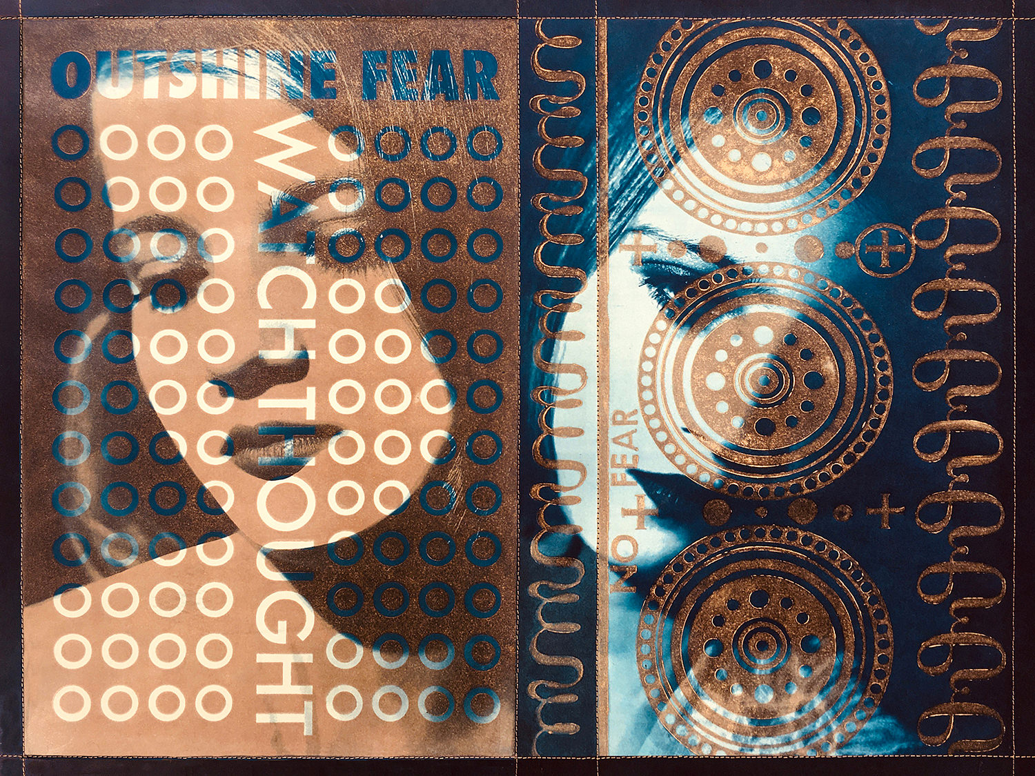
Medium: Gold Akua Intaglio Ink on Laser cut Plexi printing plates,
Aiko’s AI-232 Sakamoto Natural LW Kozo paper, combined with
alternative photographic method cyanotype.
Size: 18” height x 24” width
Date: August 2020
The cyanotype photos were developed on Aiko’s AI-232 Sakamoto Natural LW. The Sakamoto paper works brilliantly when developing and exposing the image onto the paper achieving beautiful, clear images. Because of the strength of the paper, it’s possible to expose or tone the image many times without the paper breaking down. Unfortunately, the papers are no longer being produced.
This project was based on the prompt:
Question: How does one encourage and motivate others when opportunity appears to be limited?
Answer: LOVE MORE for every hate.
I am a parent and an educator living and working in NYC. On March 22, 2020, my twin 17 years old daughters were informed that they would not be returning to their high school, three months shy of their graduation. They were attending a NYC performance & art high school, both in the visual arts program. Art is social, so when the school began teaching remotely many of the students did not show up to the online classes. Without the use of the school’s studio space, art supplies, and direct guidance from teachers and their peers, many students found it difficult to work on their own. Some students became despondent and didn’t complete their work.
Through the years I’ve been taking photos of my children and using them as my muse. It’s a great working relationship because they’re very trusting and not concerned about how they look in the final artwork. It’s very liberating for me as an artist.
For reference, you can find the original post for OUTSHINE fear here: https://www.pdpackardlovemore.com/post/outshine-fear
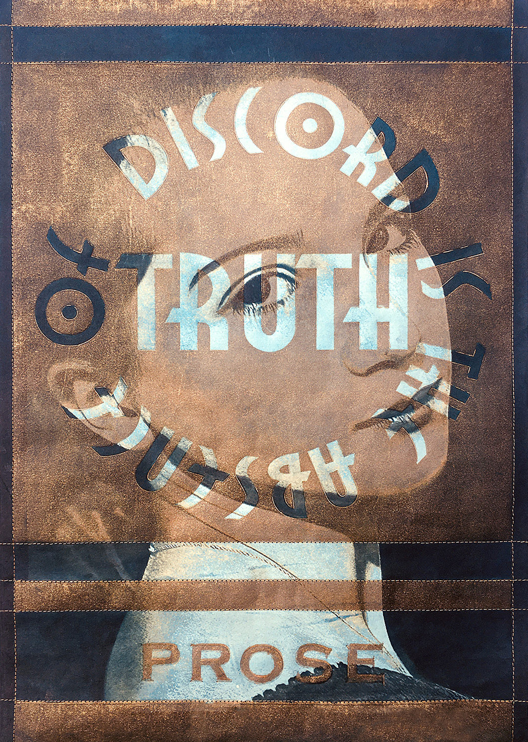
Discord Is The Absence of Truth
Medium: Gold Akua Intaglio Ink on Laser cut Plexi
printing plates, Aiko’s AI-232 Sakamoto Natural LW
Kozo paper, combined with alternative photographic method
cyanotype.
Size: 18” height x 12” width
Date: August 2020
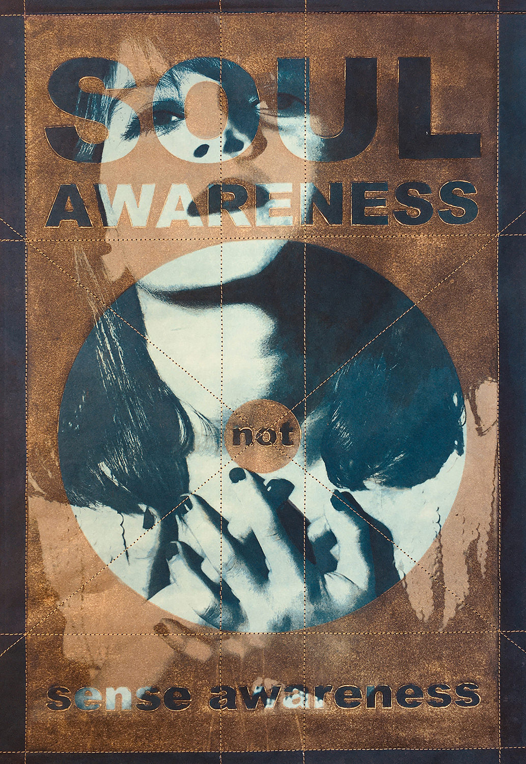
SOUL AWARENESS NOT sense awareness
Medium: Gold Akua Intaglio Ink on Laser cut Plexi printing plates, Aiko’s AI-232 Sakamoto Natural LW Kozo paper, combined with alternative photographic method cyanotype.
Size: 18” height x 12” width
Date: August 2020
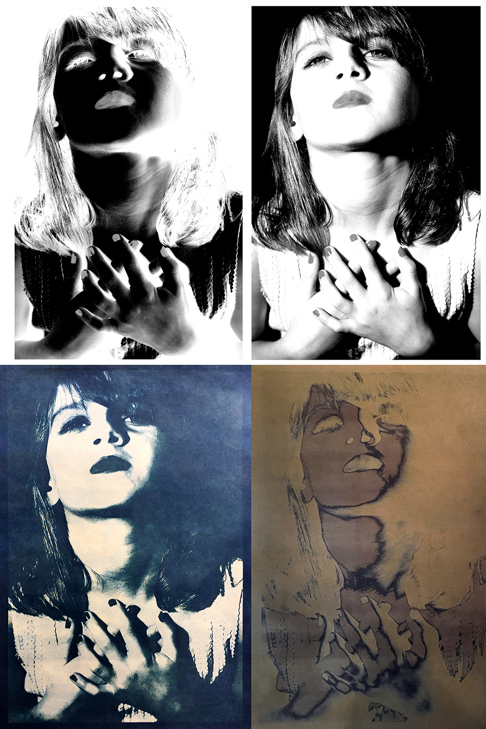
Top Right Image: Original Image
Top Left Image: Inverted Transparency (negative) Use to Expose Print
Bottom Right Image: Chemical Reaction to Sensitized (coated with cyanotype formula) Sakamoto Kozo Paper Exposed to Sun.
Bottom Left Image: Final Print After Toned in Borax Bath
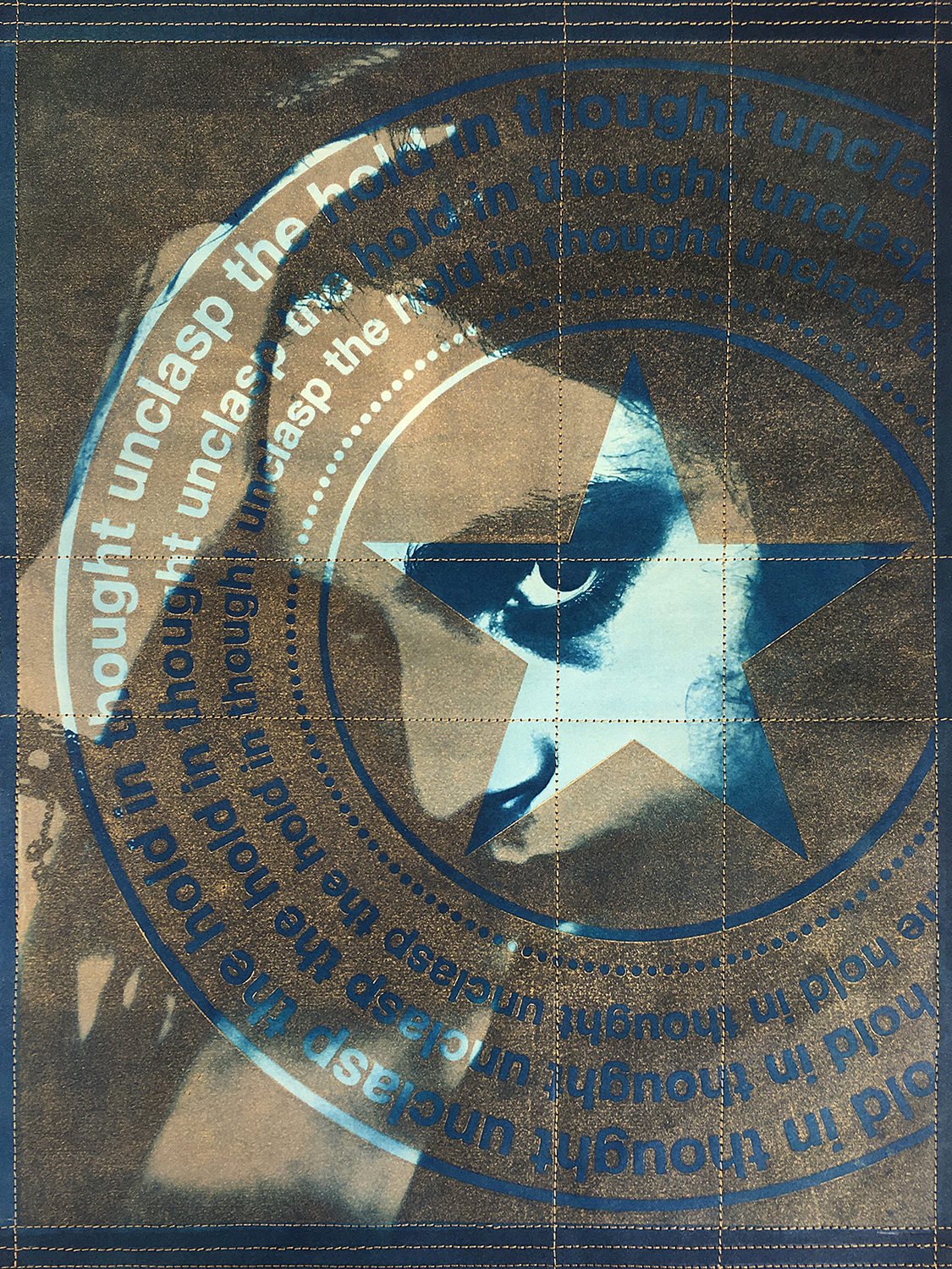
unclasp the hold on thought: think ANEW
Medium: Gold Akua Intaglio Ink on Laser cut Plexi printing plates, Aiko’s AI-232 Sakamoto Natural LW Kozo paper, combined with alternative photographic method cyanotype.
Size: 18” height x 12” width
Date: August 2020
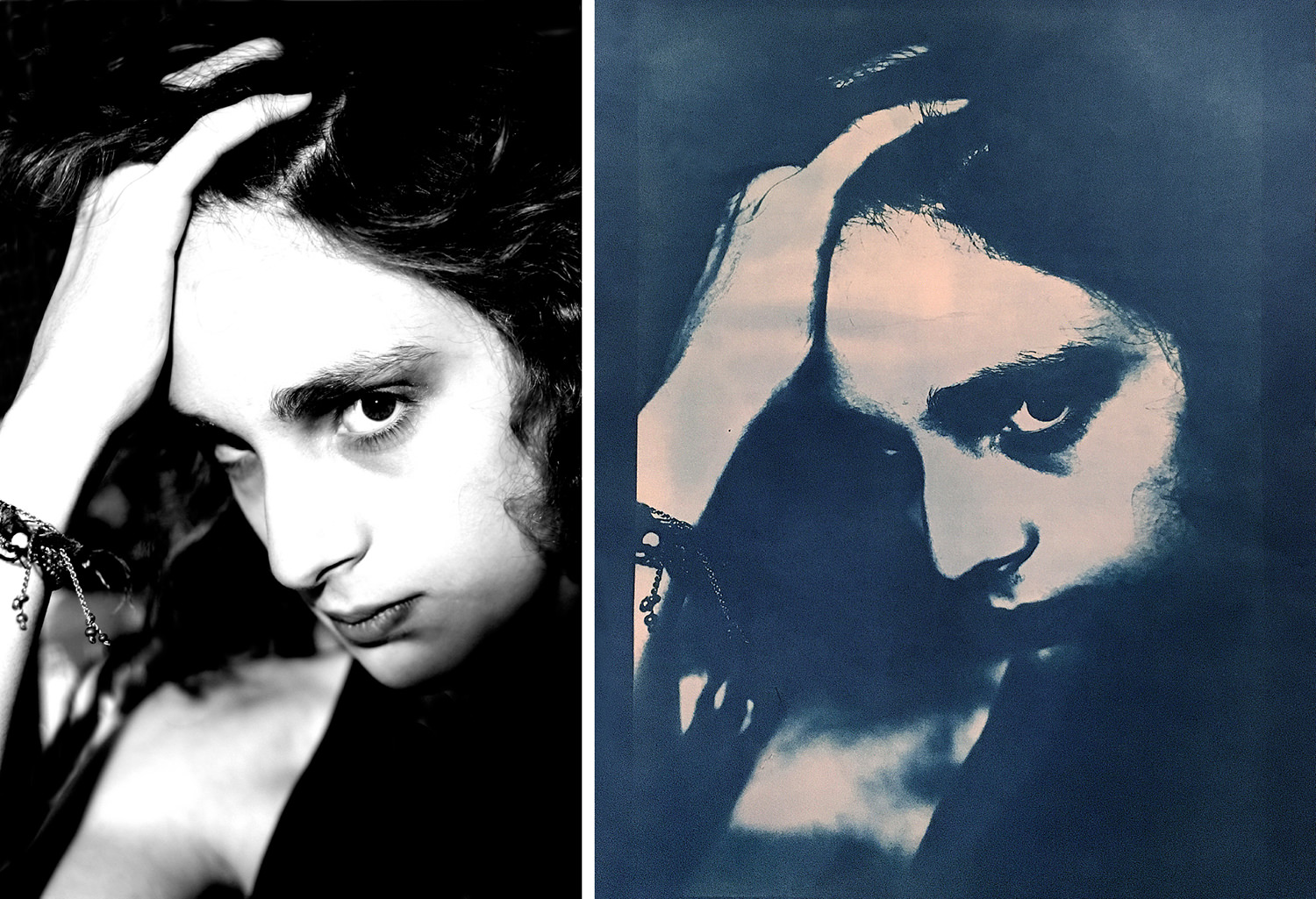
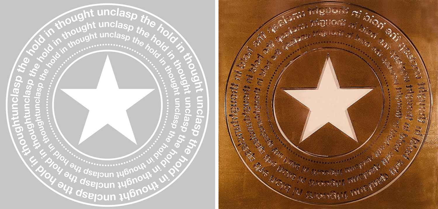 Process for unclasp the hold on thought: think ANEW
Left Image: Computer Generated Artwork for Printing Plate
Right Image: Akua Intaglio Metallic Gold Inked Laser Cut Plexi Printmaking Plate
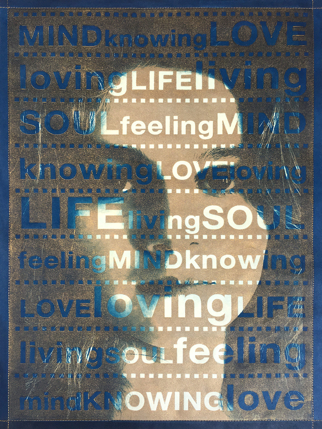
Life living Love loving Soul feeling Mind knowing
Medium: Gold Akua Intaglio Ink on Laser cut Plexi printing plates,
Aiko’s AI-232 Sakamoto Natural LW Kozo paper, combined with alternative photographic method cyanotype.
Size: 18” height x 12” width
Date: August 2020
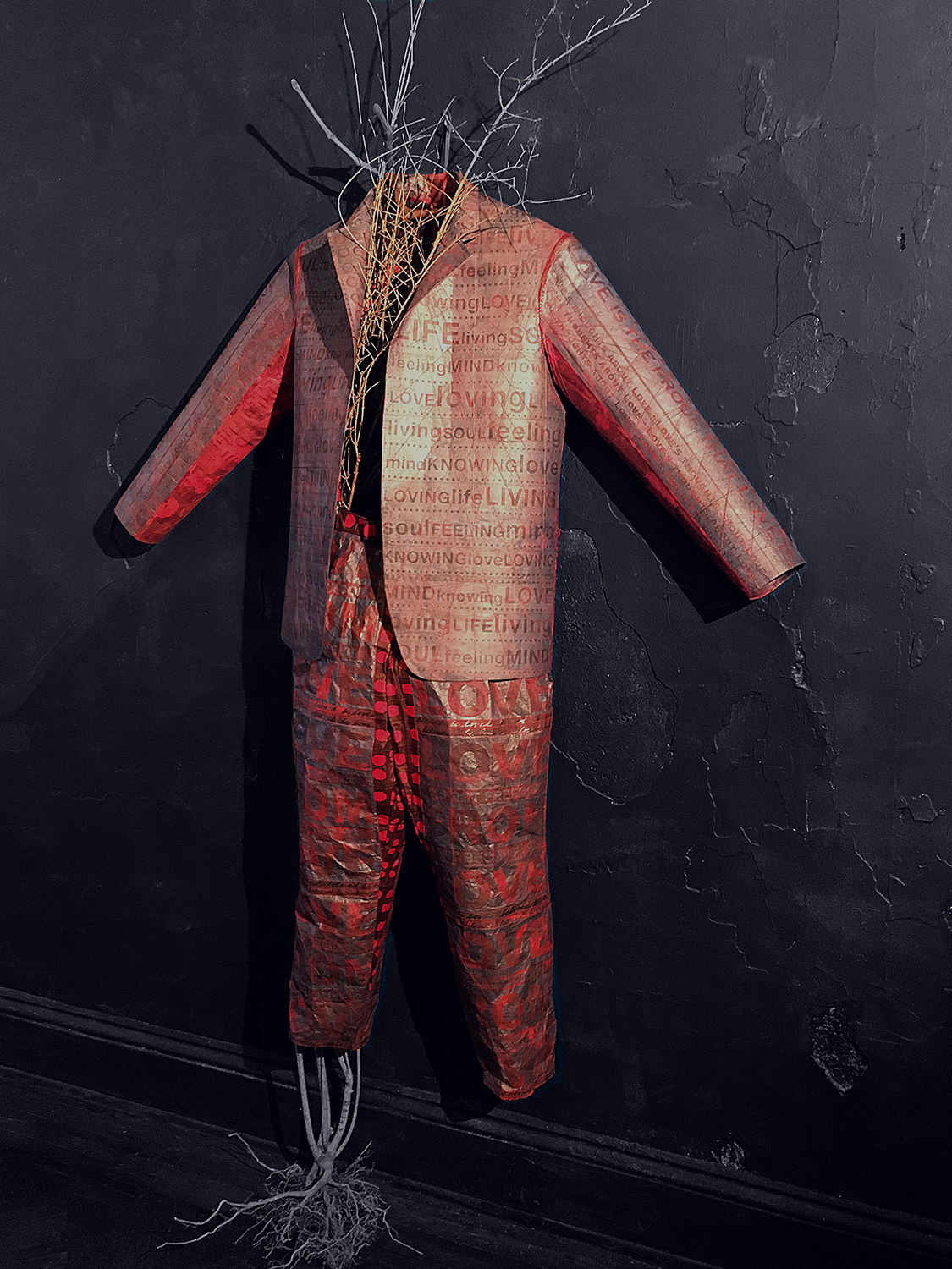
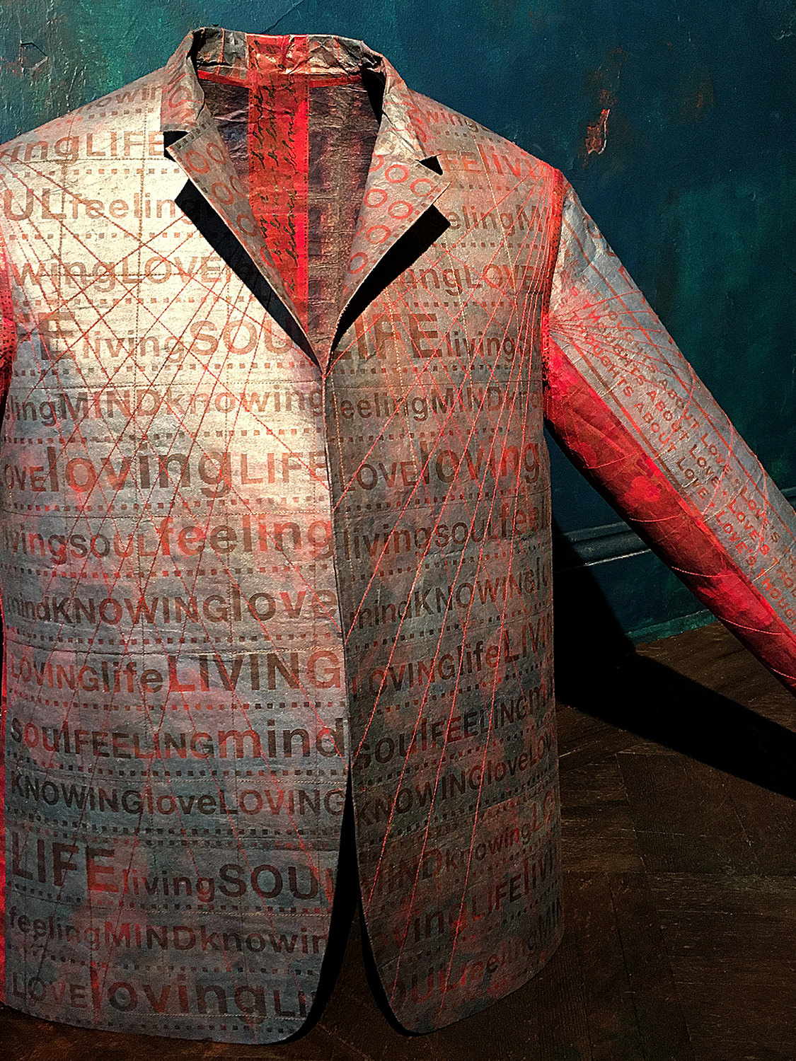
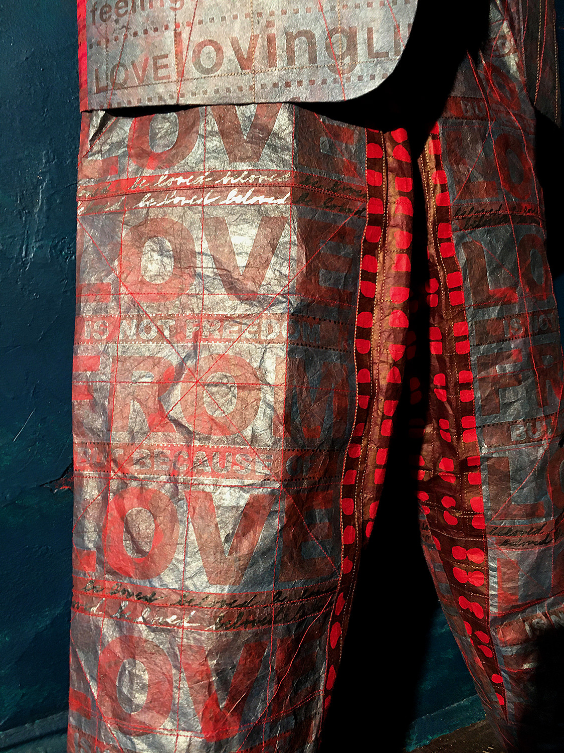
Armour Clad in LOVE: quarantine in NYC
During the end of the March 2020 quarantine in NYC, I took early morning walks through nearby Prospect Park, in Brooklyn, NY, collecting tree parts to use as content for the short films I create. With skills from my years designing in the fashion industry, I created a suit using the printing plates from OUTSHINE fear and my printed decorative papers on Japanese Kozo paper. The Kozo paper is so strong and resilient that the suit can actually be worn.
The suit represents the idea of our earth, and all of humanity as being armour clad, and protected by LOVE.
Medium: Decorative paper & Akua Intaglio Ink on Laser
cut Plexi printing plates, M-0207 Kozo White Text Weight
with Sizing-56gsm.
Size: 72” height x 50” width, assembled
Date: April 2020
Medium: Decorative paper & Akua Intaglio Ink on Laser
cut Plexi printing plates, M-0207 Kozo White Text Weight
with Sizing-56gsm.
Size: 72” height x 50” width, assembled
Date: April 2020
Medium: Decorative paper & Akua Intaglio Ink on Laser
cut Plexi printing plates, M-0207 Kozo White Text Weight
with Sizing-56gsm.
Size: 72” height x 50” width, assembled
Date: April 2020
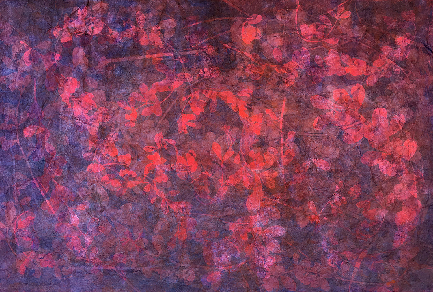
Medium: A ground layer was created using my Printed Decorative
paper method, using dried plants as a stencil together with printing
multiple layers of plates inked with the transparent-like Akua Liquid
Pigments on M-0207 Kozo White Text Weight with Sizing-56gsm.
Size: 25” height x 37” width
Date: April 2020
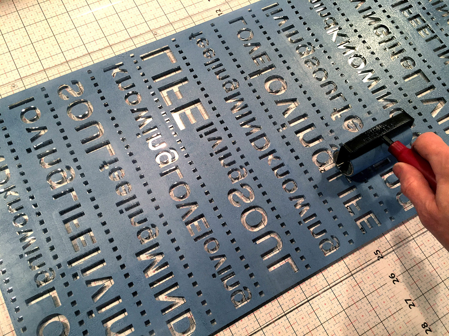
Armour Clad in LOVE
Medium: The final top layer was printed with the Akua Intaglio
Inks using laser-cut Plexi printing plates. The sheen on the print
was created by adding silver metallic intaglio ink to ultramarine
blue and phthalo blue. The original designs for the laser-cut plates were computer-generated.
Size: 25” height x 37” width
Date: April 2020
For reference, you can find the original post here: https://www.pdpackardlovemore.com/post/armour-clad-in-love-quarantine-in-nyc
What influences inspire you and why?
In the book, Saul Bass A Life in Film & Design, he describes the ideal trademark as “thinking made visible.” That’s a principle I strive to express in my artwork. I’ve always loved bold graphics, with self-similar images and mathematical order. In the late 80s, a friend took me to hear a lecture on graphic design given at FIT (Fashion Institute of Technology), in NYC. I had no idea who the guest speaker was, and in my naive mind, he looked like some regular, middle-aged man wearing a suit and heavy, black-rimmed glasses. He was introduced as Saul Bass, the American graphic designer, and filmmaker. From the start, I was incredibly impressed with his work especially when he showed his title sequences he had created for many well-known movies, like The Pink Panther and for films by Alfred Hitchcock. For Hitchcock’s movies, North by Northwest, Vertigo, and Psycho, Bass invented this type of kinetic typography in his title sequences that I love. Bass was also a prolific trademark or logo designer, and many of his logos are still in use today, showing the longevity and strength of his work. Longevity and strength are traits that I greatly admire in anyone’s work.
Graphics and film have made a big, inspirational impact on me as a designer and visual artist. In 2018, I began creating short films, or vignettes. I use printmaking in combination with Nature to create visual poetry that shares my thirst for color, nature, and unconditional LOVE, not conditional romance. To bring my artwork to life I interlace and overlay live-action video with flat animation mediums in combination with music that flow from one scene to the next.
My most recent short film project was organized by the artist pair, Phyllis and Victor Merriam of the thepostdigitalprintmakers, and Susan Rostow of Akua Inks. I was invited to create an original animation for PRINTFLIX, a film screening featuring ten artists that use printmaking in combination with animation. The screening was held during the SGC International MakerReady Virtual Event Saturday, April 10, 2021, showcasing the Armour Clad in LOVE suit made with papers sourced from Paper Connection.
Short Film, Armour Clad in LOVE:
Paper Connection papers used: Aiko’s AI-232 Sakamoto Natural LW, Natural Kozo Medium Weight-44gsm M-0202, and Kozo paper G-0008.
Mediums: Drypoint etching, Relief printmaking, laser-cut printmaking plates, and cyanotype.
View Here: https://www.youtube.com/watch?v=R4Fo-u4w5_0
If you could converse with any artist present/past, who would it be and what would you ask?
Due credit goes to Kojiro Ikegami, one of Japan’s leading professional bookbinders.
Many years ago, I bought his book titled, Japanese Book-binding, Instructions from a Master Craftsman. Although I believe he is no longer living, I would love to have had the opportunity to thank him for generously sharing instructions for making major, historically important styles of Japanese binding and book cases. I find that when you’re focused on creating the most beautiful artwork, or in his case, binding books, most of your time is spent resolving technical problems that might come up when executing a piece. It takes a lot of humility to freely share your knowledge with others when you’ve spent a lifetime committed to perfecting your skills. I am so grateful that I have access to his easy-to-use book-binding instructions and have been able to expand his principles into box art, custom-framed artwork, freestanding walls, and so much more. I can only imagine how special the opportunity was to train under this master.
Do you have any upcoming shows?
I am currently part of the traveling exhibition called:
CONNECT: Small Prints by Members of The Boston Printmakers 2021 – 2023
This small print show was developed in partnership with the venerable Providence Art Club in Rhode Island to celebrate The Boston Printmakers upcoming 75th anniversary in 2023. Prompted by the theme of “communication,” with a suggested image size of a cell phone, or no larger than 8”x10”, members of the Boston Printmakers were asked to create prints about “messaging,” “news,” or content they wanted to “post.”
Upcoming Exhibition Dates:
October 2022: Oregon Society of Artists, Portland OR
Dates TBA
March 5, 2023 – April 5, 2023: Center for Contemporary Printmaking
Share your current projects:
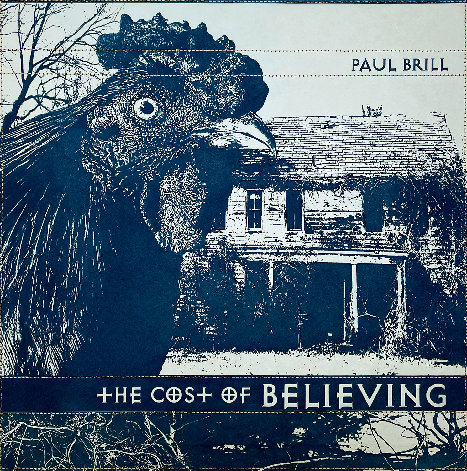
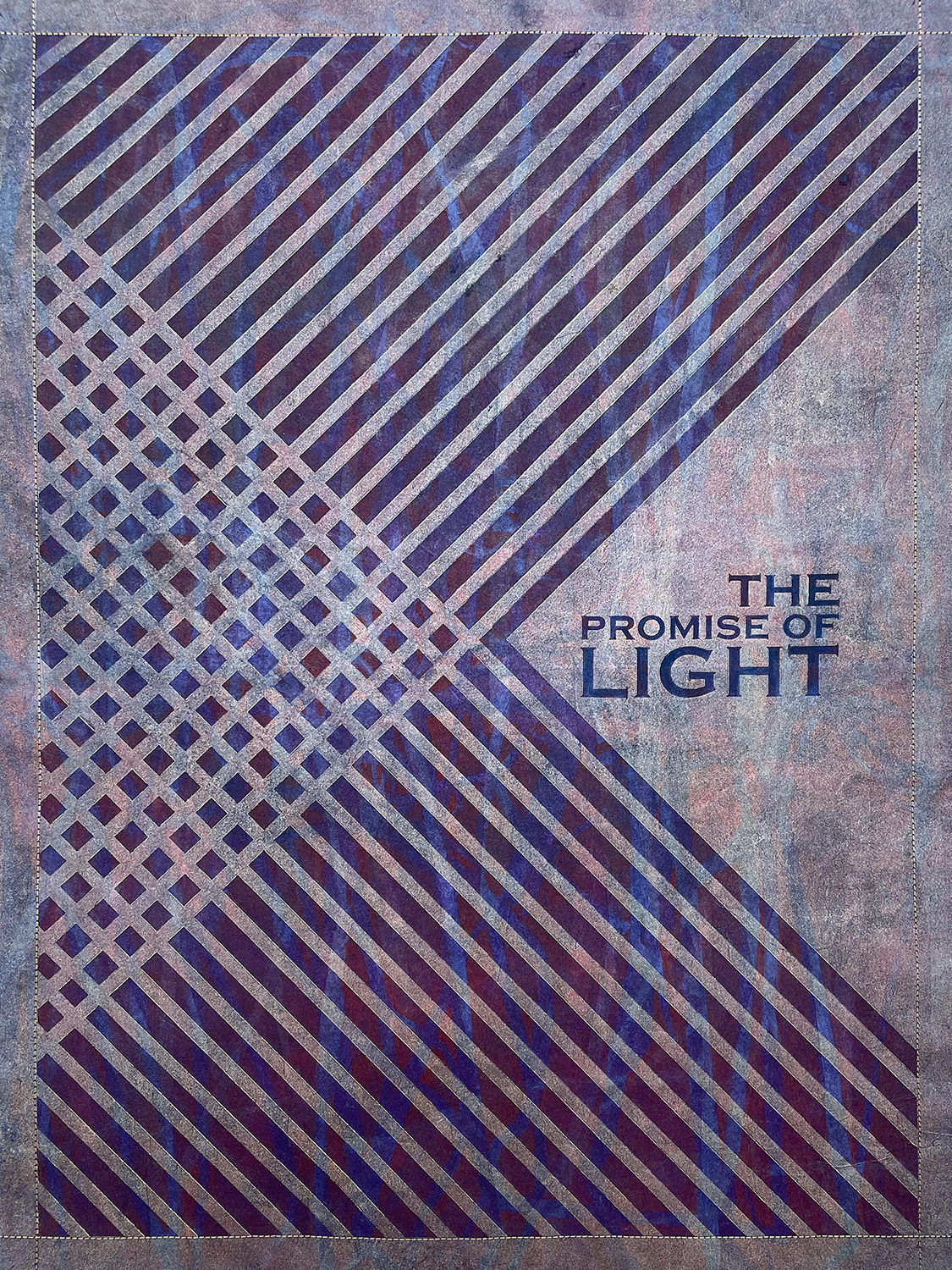
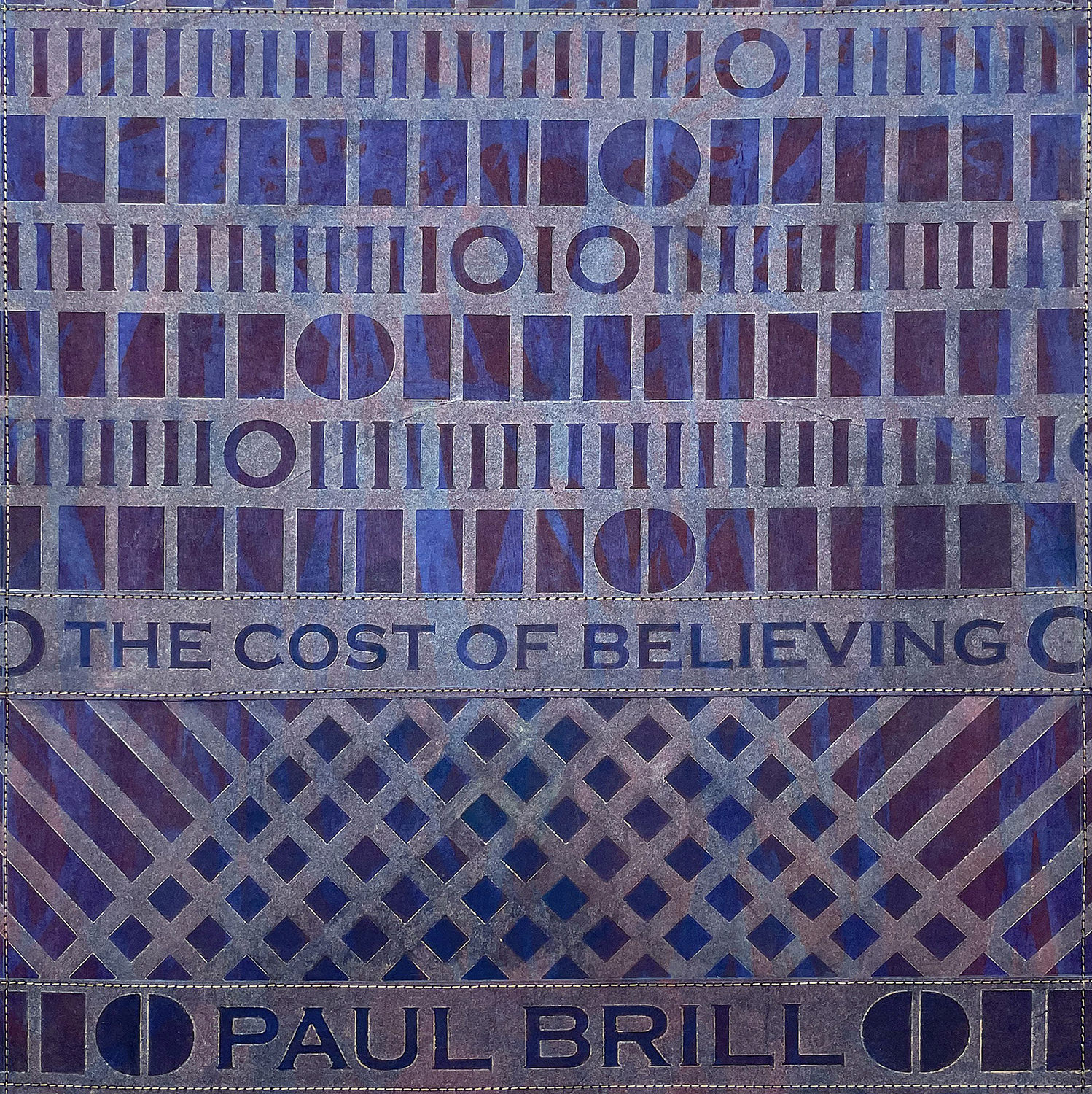
Since March 2022 I’ve been working with the American composer, songwriter, and producer Paul Brill on a commission to create the artwork for his latest 12” vinyl record, The Cost of Believing, and for “45” or 7-inch vinyl singles scheduled to debut in October 2022.
Paul gave me the freedom to create what I want, which is an artist’s dream. I am truly grateful for this commission. Initially, it was a challenge because there were practically no rules and infinite directions in which I could go. I’ve listened to his music several times during the process of recording the album, but my focus was on interpreting his lyrics visionally for the album cover in the most beautiful, collaborative way.
On June 9th I presented the first step of the project, a body of original artwork for the album cover that consisted of sixteen unique pieces. Using the techniques of cyanotype, decorative papers, and laser-cut printing plates all the original artwork was created on Aiko’s Sakamoto Heavyweight-AI-224B, Kozoshi Natural Extra Heavyweight-M-0206-#3-80gsm and Kozo White Text Weight with Sizing-56gsm M-0207.
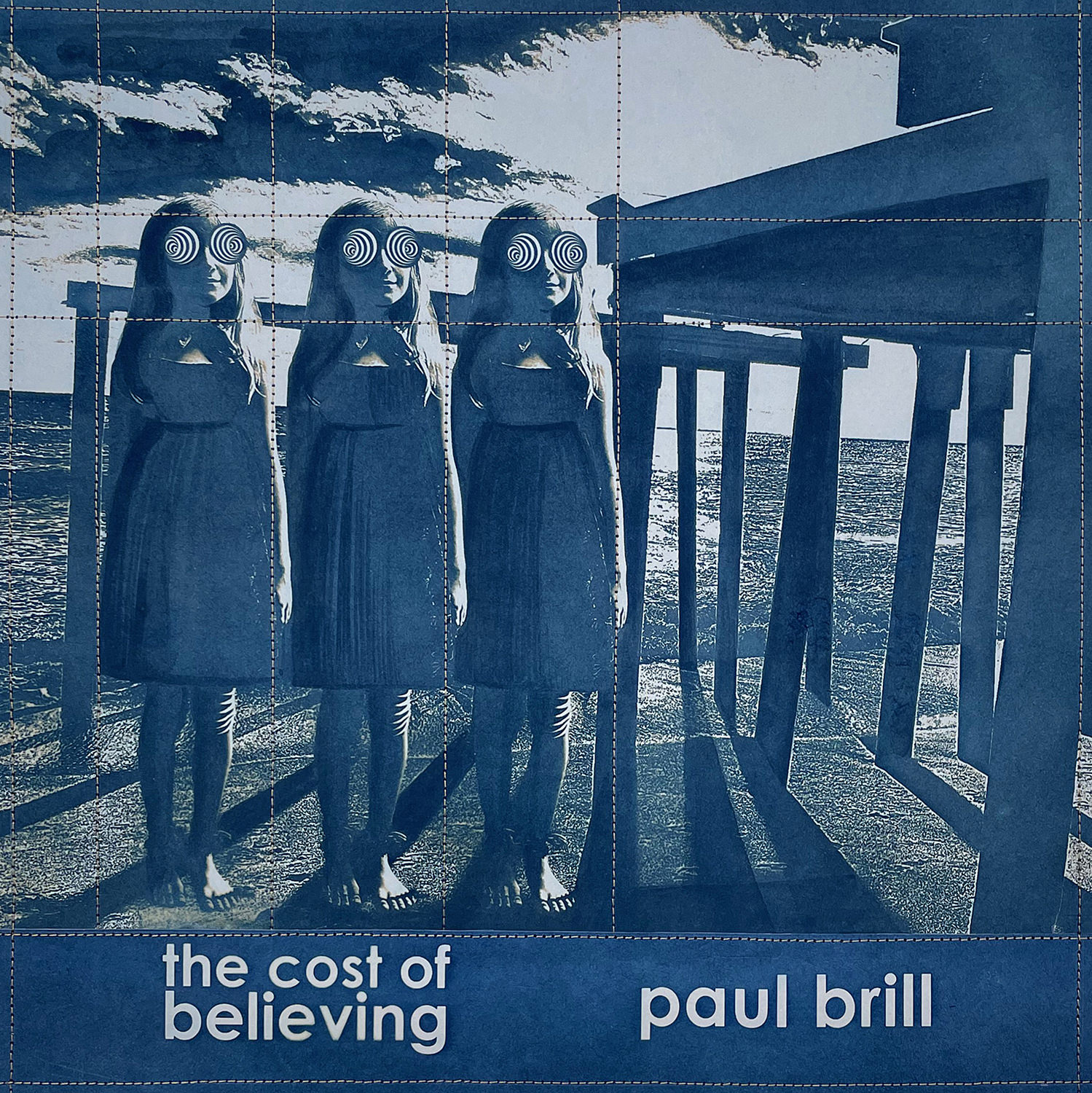
Here’s a selection of the recently presented artwork for the album covers.
Medium: Alternative photographic method
cyanotype on Aiko’s Sakamoto Heavyweight-AI-224B
Size: 12.5” height x 12.5” width
Date: June 2022
Medium: Alternative photographic method
cyanotype on Aiko’s Sakamoto Heavyweight-AI-224B
Size: 12.5” height x 12.5” width
Date: June 2022
Medium: Computer-designed laser-cut Plexi printing plate, decorative papers, on Kozoshi Natural Extra Heavyweight-M-0206-#3-80gsm
Size: 24” height x 18” width
Date: June 2022
Medium: Computer-designed laser-cut Plexi
printing plate, decorative papers, on Kozoshi
Natural Extra Heavyweight M-0206-#3-80gsm
Size: 12.5” height x 12.5” width
Date: June 2022
PD Packard
Contact Email pdpackard@pdpackard.com
Website www.pdpackard.com
Check out our Monthly Subscription Service and Shop Paper Pastiche!