
He is an established letterpress printer in the Providence, RI, area, teaches letterpress at RISD, unique to say the least, and our Artist of the Month for January. We wouldn’t want to start 2014 off any other way. This has been a long time coming, as we have known Dan for many years. It’s worth the wait though, as we peer into his ever tinkering, witty, quirky mind, and talk about paper!
PCI: We have know you for a while, Dan, but please share with our readers and paper fans what kind of artwork do you do? What or who has influenced/inspired you?
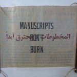
DW: I am a printer and printmaker, and run my own letterpress print shop, DWRI Letterpress in Providence, RI. The shop does commercial letterpress work, from invitations to business stationery to many, many collaborations with artists and designers. In my own prints, I make work from various sources, (found printed objects, photographs, type, etc) with ink and paper using way too many cast iron printing presses. My own work involves a lot of type, coarse halftone images, old newspapers, etc., to bring these earlier printed objects back into the mainstream.
Inspiration? Pretty much everything, but as far as artists go, I always loved Saul Steinberg as a kid and adult, and also Jean Tinguely, the French sculptor who made the self destructing Homage to New York.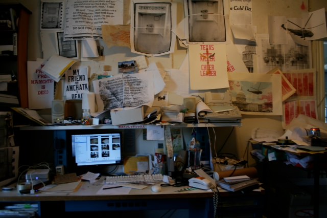
PCI: What attracts you to working with paper? What do you like best about working with paper?
DW: For paper, and prints in general, I like the fact there is a certain amount of permanence, the idea the paper once printed is now a record of that earlier process. It has some depth and dimension when printing via letterpress, but not nearly as much as the plates or type that went into making it. There is also a delicateness, and fragility, in contrast to the greasy messy machines that it is surrounded by, and somehow, they both come out ok.
PCI: How did you hear about our company, Paper Connection?
DW: I dont remember! It’s Rhode Island, so at some point when the need for a particular paper came along, I’m sure someone said, “Hey, I know a guy…” or in this case, “hey, I know a gal…”, and that was that. Let me think, what and when was it…
PCI: We recall it was through a local stationer on the West Side…..
So, back to the days before we knew about each other; how much knowledge of washi and other Asian papers did you have before using our supply?
DW: A little bit, but only from a printmaking perspective with chine collé, etc…nothing like the Lokta (20×30 inches $4.00/sheet and a 3 x6 feet natural lokta @ $30.00/sheet ) or Pang Pi (45×80 inches $20.00/sheet), I like to use for my work.
PCI: More on those two specific papers later. How did we help navigate and perhaps inform you about Japanese paper?
DW: The most educational aspect for me is of the contemporary position of traditional paper makers and artisans in Japan and in the world, and how important it is to support like-minded artisans if indeed we value what they produce. You can feel that labor of love in the paper itself, and I am not a touchy-feely-gaga-over-paper person.
PCI: And that’s okay! We really appreciate the awareness you share regarding the artistic nature of the paper makers themselves. They are truly National Treasures. Which papers do you use of ours and for what printmaking process? How do these papers interact with your take on letterpress?
DW: So, the printing process I use is letterpress printing, which at its core is basically just a mechanized from of relief printing (inking a raised surfaced and pressing it onto a paper like substrate). Many Japanese papers are ideally suited for this method, for use in traditional Japanese relief printing. For me, however, I gravitate to the slightly grittier papers like the Pang Pi (oversized kozo) from China (45×80 inches $20.00/sheet), and Lokta from Nepal (3×6 feet natural lokta @ $30.00/sheet. ) I like these papers as they are both available in huge sheets, and for my uses have a quality similar to the old newspapers I am referencing sometimes in my work. They both also react and hold ink exceptionally well, but have a thickness and feel not unlike the western cotton and wood based papers used in my artwork and shop.
PCI: What are some of the differences between our papers and others you have worked with?
DW: The main stereotypical difference is that sulfite , (wood pulp), and cotton papers tend to need to be much, much thicker to be stronger sheets, while mulberry and other papers can be exceptionally strong and also super thin. They can then have a sleekness without being calendered or overtly manufactured, but still hold together.

PCI: So in this case, especially for those in the letterpress field, thin doesn’t mean weak, and thick doesn’t mean strong. Tell us which Paper Connection paper you would recommend for a particular application:
DW: I like PANG PI paper for LETTERPRESS because it IS REALLY BIG AND HOLDS BLACK INK REALLY WELL. And it is cool.
PCI: Our famous bonus question: If you could have a conversation with any artist present or past, who would it be? And would you talk about paper?
DW: At this point, I would be happy to talk to any artist, (or anyone really), who managed to just keep his or her cool, despite whatever pressures. That’s about it. I feel lucky to be able to work and talk crap with so many people and artists already, especially fellow letterpress and other printers – they are weird in a lot of very particular ways.
PCI: Dan, thank you so much. We feel like you taught us a thing or two on letterpress, and we really appreciate your presence in our humble Ocean State. Thank you for being such a huge support of Paper Connection!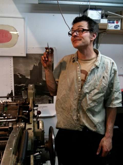 For more on Dan Wood’s work and his letterpress studio, please visit his website: dwriletterpress.net
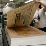
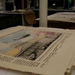
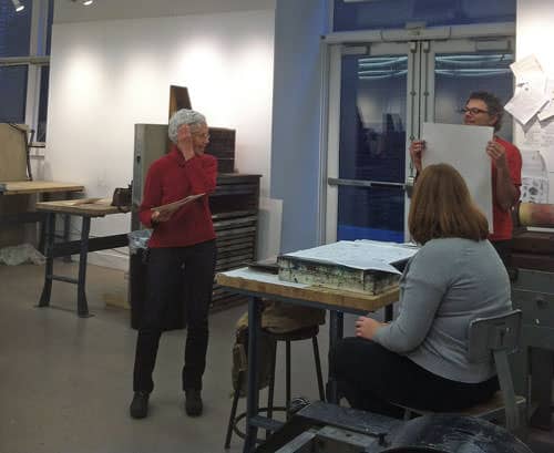
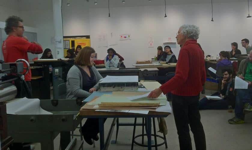
A visit to Dan’s letterpress class at RISD (Rhode Island School of Design, Providence, RI)
Jane and Francesca, two of our paperwomen, had the chance to enlighten aspiring printmakers of the future, on the beauty of washi and letterpress. A common misconception is that paper must be thick, and framed by those wonderful deckle edges we see on so many letterpress invitations. Not so, as we all discovered at the class. Just because washi is thinner, doesn’t mean it is weaker.
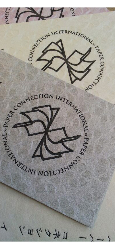
 Searching for the 8th wonder of the world on Japanese Plum Blossom Lace paper, backed.
Stocked in 3 colors: pink, gray and coconut cream; 21.5×31 inches @ only $6.00/sheet at Paper Connection: 401-454-1436.
Paperwoman’s letterpress printed business cards on Japanese Plum Blossom Lace Cardstock, by Dan Wood.